Design a readable book back cover that fits the front and spine, uses a clear content hierarchy, and leaves room for barcodes and print safety.
The front cover is done. Title, author, and image all feel settled. Then you turn the panel over, or open a full-wrap preview, and the back looks empty, random, or crowded with leftover marketing lines. That is the moment book back cover design actually begins.
A back cover is not a second front, and not a storage wall for every marketing detail. For print, it is one face of a single full wrap: back, spine, and front. The panel has to finish a short decision for a browsing reader, stay readable at print size, still feel like the same book as the front, and keep critical text clear of the barcode area, folds, and safe margins.
Detailed fiction and nonfiction writing belongs in Book Back Cover Content. Exact dimensions and export checks belong on the full-wrap and calculator pages linked later. If you already have a finished front, you will keep that art and complete the wrap; if you are starting from scratch, you build the full cover system first. Both product paths appear at the end of this guide.
You have placed a description, maybe a bio, maybe a website line. On screen it looks filled. At real size, nothing leads the eye, and a reader who flips the book still does not know whether this is their book.
Under time pressure the back has three jobs: confirm the right reader, present the core pitch in a scannable order, and support that pitch with only the proof that earns space. Production zones - barcode, safe margins, folds, spine - limit where those jobs can sit. They are not a fifth sales block.
Name the persuasion job before you decorate:
When it works, a stranger can answer "is this for me?" in a quick scan. Secondary blocks do not outrank the blurb. Nothing critical sits where trim, fold, or barcode work will cut or cover it. Design the panel for the full wrap file, not as a standalone downloadable image. That practical success is the standard, not a sales guarantee, ranking claim, or platform approval promise.
Two opposite problems land in the same place. In one version, synopsis, praise lines, a long bio, awards, and a website fight for the same rectangle until type shrinks to almost fit. In the other, the front is intentional while the back is a blank field with a thin paragraph and a lonely barcode box, so the wrap reads like two products glued together.
Crowding fails even when every sentence is true: optional support got treated as required inventory. Emptiness fails when the book still needs a clear pitch and the back was left as leftover space instead of a persuasion surface.
Work in three layers. Exact wording lives in Book Back Cover Content; here you only decide what the design must hold, may hold, and must protect.
| Layer | Blocks | Design rule |
|---|---|---|
| Core | Main blurb or short description; optional top hook or tagline | Give the main pitch the largest continuous reading area. Keep it short enough that print size still reads. |
| Support | Endorsement or short praise; short author bio; optional author photo; small website or imprint mark | Add only when the block earns space. Prefer one strong, attributable endorsement over several weak ones. Nonfiction often needs a short bio more than fiction does. Skip photo or praise when you lack a credible asset. |
| Production | Barcode reserve; ISBN or price handling as your channel requires; spine text when eligible | Protect these on every print cover. Leave barcode space clear even if the platform can place a barcode for you. Spine text depends on page count and width; it shares the wrap but is not part of the back-panel reading order. |
If copy grows, cut secondary blocks before you shrink type. If the panel feels empty, strengthen the core pitch and one support block - do not scatter decoration. Mark each element must keep / can shorten / can cut.
In the editor, the blurb looks fine. At 100% zoom or on a proof, contrast collapses, lines stack into a dense rectangle, and an endorsement sits larger than the pitch itself.
"Read this first" is size, weight, contrast, and space. Busy backgrounds win over sentences when hierarchy was never assigned, and type drifts toward platform minimums instead of a scannable primary size.
Use a default eye path for many paperbacks, then adjust for the book:
That order is a default, not a law. Some books lead with one powerful endorsement. Some literary or poetry panels stay almost empty. Some nonfiction panels use short benefit lines under a tight opening. What matters is an obvious path, with secondary items never outranking the main pitch.
Make the panel scannable: one clear primary size for the blurb, smaller supporting sizes, high contrast, space between blocks, short paragraphs or benefit lines. Stop adding elements when the next one forces everything else smaller.
Amazon KDP warns that cover text should contrast with its background and recommends type large enough to read, with a stated minimum around 7-point. Treat that as a floor for submission risk, not a design target. If the draft only fits by going below a readable size, the copy is too long - return to content priority rather than forcing the layout.
The front uses a warm palette and a distinctive display face. The spine is a flat neutral strip with unrelated type. The back is a stock texture or a pure color that never appears on the front. On a full preview, the object does not read as one book.
Designing the back as an isolated rectangle, or pasting the front art again, both break continuity. The spine often becomes a utility strip instead of a bridge.
Continue enough of the front's design language that the book still reads as one object: related color, compatible type, shared mood, and a background that can bridge into the spine. You do not need the same illustration on both panels. You do need a continuous system across back, spine, and front.
Give the back a quieter job than the front: lower noise behind the main text and choose a background that supports type. Treat the spine as a bridge - continue background through it, and avoid hard color seams exactly on the folds. Spine text is separate from back-panel hierarchy. For KDP paperback uploads, it is tied to a page-count threshold (currently at least 79 pages for uploaded covers; Cover Creator wording uses 80). Confirm the live rule before forcing a long title into a thin spine.
The layout is approved emotionally. Then the calculator, barcode reserve, hardcover hinge, or bleed requirement lands. Important praise or the end of the blurb sits in a risk strip. Backgrounds stop at the trim line. Moving every text block becomes the project - because hierarchy was locked before geometry.
For KDP paperback and similar print-on-demand workflows, the cover you submit is one PDF containing back, spine, and front. The back panel is not a separate approved deliverable by itself.
See How to Make a KDP Full Wrap Cover for the production sequence, and use the KDP Cover Size Calculator for dimensions from final trim size, page count, and paper settings. Official owner of current KDP rules: Create a Paperback Cover.
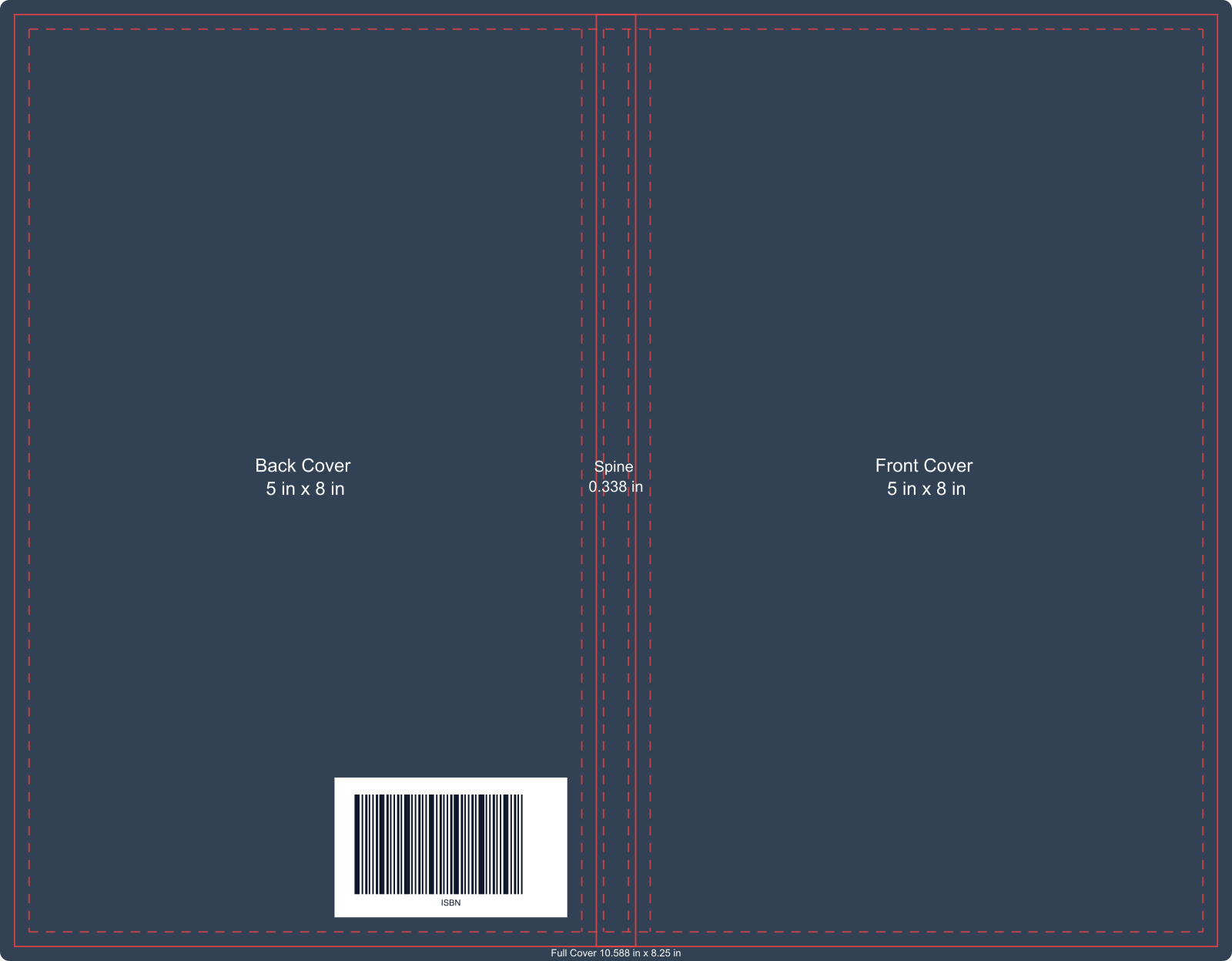
Here is one 5 x 8 inch, 150-page paperback example. It makes the relationship between the Back, Spine, Front, and barcode reserve visible. The dashed guides belong to this example; use the current calculator and platform template for the exact safe-area and bleed rules for your book.
| Zone | Design implication |
|---|---|
| Bleed | Backgrounds and edge art must extend beyond the finished trim so white edges do not appear after cutting. |
| Safe area | Keep live text, faces, logos, and critical art inside the safe zone, away from trim and fold risk. |
| Spine folds / hinges | Do not park important back-panel content against the spine edge. Hardcover designs also have hinge geometry; keep text and barcodes out of those risk strips. |
| Barcode reserve | Keep a clear, low-detail area for the barcode. If the platform places one for you, still design as if that rectangle will be occupied. |
| Spine text eligibility | Confirm page count and width before committing to spine type. |
Exact measurements differ by platform and binding. Plan hierarchy first, then protect production zones. Export one full wrap for the current book settings, not a back-only crop.
You know the blurb is roughly ready, but every arrangement feels arbitrary. Fiction, how-to nonfiction, and poetry all get the same dense center column. Layout is being chosen as decoration instead of as a content-first pattern.
There is no single grid that fits every book. Start from a pattern that matches how this book persuades. Three practical patterns show up in many author workflows. They are design aids, not publishing laws.
Blurb first works when the story or premise is the sale: optional short hook, multi-sentence blurb as the center block, one endorsement or short author line if room remains, barcode reserve at the bottom. Common fit: novels and narrative nonfiction.
Benefits first works when the reader is buying a result: audience or problem line, short opening plus a short list of outcomes, optional authority bio or domain endorsement, barcode reserve at the bottom. Common fit: how-to, business, and education nonfiction. A short list can help scanning; an arbitrary bullet count is not a rule.
Minimal works when restraint is the genre signal: one short statement or quote, optional thin supporting line, generous empty space, barcode reserve at the bottom. Common fit: poetry, literary work, and other short-copy books.
How to choose without overthinking:
When writing problems dominate, stop designing and finish the brief in Book Back Cover Content.
Some authors start with a finished front from a designer, a design-tool export, or an earlier eBook cover. Others still need the whole cover system. For print, "make a back cover" is almost always a full-wrap task. Use this order when you have a draft book and either a finished front or a clear front direction.
Then choose the product path that matches your starting point. For the common case in this guide, where a finished front needs a usable back and spine, the Converter is the shortest next step. This page is a design guide, not a free-standing back-cover generator.
Have a finished front cover? Start here: use the eBook Cover to Paperback Cover Converter. Keep the finished front, set the print specs, add back and spine content, review the full wrap, and continue toward a print-ready export.
Still need the front or the whole cover? Use the KDP Book Cover Generator. Create the front around your book format, then move into the full-cover workspace for back, spine, and preview.
Optional AI Back background: in the full-cover workflow, AI Back is an optional background for the flat back panel. It does not write your blurb, place endorsements, invent barcode art, or produce a finished wrap by itself. Copy, layout, spine text, and production reserves still follow the hierarchy and rules above.
Related guides: